Sunday, September 19, 2010

Okay, Okay - I Just Couldn’t Wait Any Longer!

Campania Necklace with Hessonite Garnet, Kyanite, Copper Rutilated Quartz and Dyed Freshwater Pearls Featuring an Italian Glass Fob

Beautiful Rich Autumn Colors - Notice The Generous Kyanite Wrapped Briolette Charm and Byzantine Gold Cross Flanking the Gorgeous Blue Italian Intaglio Fob With It's Birdcage Shank/Bale Design

You know, there are people that get a few extra dollars and it burns a hole in their pocket - then their are those like my hubby who like to squirrel it away!  I won’t mention which of those two categories I really fall into - but, suffice to say those Italian intaglio fobs were like $$$ burning a hole in my pocket!  They kept calling my name every day and my resolve to wait for someone to inquire about them just evaporated like rainwater on the sidewalk in 105 degree weather!

In This View, You Can See The Roman Mythological Figure Holding a Lyre With Cupid in The Lower Right

Campagia Necklace - 31 Inches of Classic Beauty
Since camel is this Autumn’s hot color, it inspired a design that I thought would be fabulous for Fall.  Waiting for cool weather in Arizona is  a bit like waiting for maple trees to fill a bucket with sap! For those lucky souls that will have crisp, cool Autumn days in the next few weeks, the Campania Necklace would be perfect with your camel suede skirts, jackets or cashmere sweaters.  Lucky, lucky you!

Thursday, September 16, 2010

A Fascination - Intaglios

Boxed Sets of Antique Plaster Intaglios from Grand Tour Holidays

I first came across intaglios (pronounced: in-tal-yos) while vacationing in Europe one summer.  I was immediately entranced by the chalky white plaster images of classical mythological stories.  Although I could not convince my hubby to let me purchase some reproductions to bring back (he is always the practical one - “they will be broken before we get home!”) - over the years, my fascination remained and I finally scored a boxed set of antique plaster intaglios during an antiquing trip to Maine.  Plaster intaglios were marketed in Italy during the 18th and 19th centuries as souvenirs for wealthy American and English tourist as keepsakes of their European Grand Tour holidays.  The small plaster medallions were mounted into books and each medallion was documented with beautiful handwritten notations.
via Swedishdekor


via Swedishdekor

Plaster intaglios are technically not intaglios at all, but rather considered cameos as the relief is carved outward rather than into the plaster.  They make gorgeous accents for interior design as their chalky white designs are so classical in nature.  Antique intaglios are rather expensive and difficult to find, but reproductions are abundantly available today and go with most any decor.  As part of my kitchen family room renovation, I am planning to finally frame a grouping of my antique intaglios to go over some boxwood topiaries that flank a biblioteque in the family room.

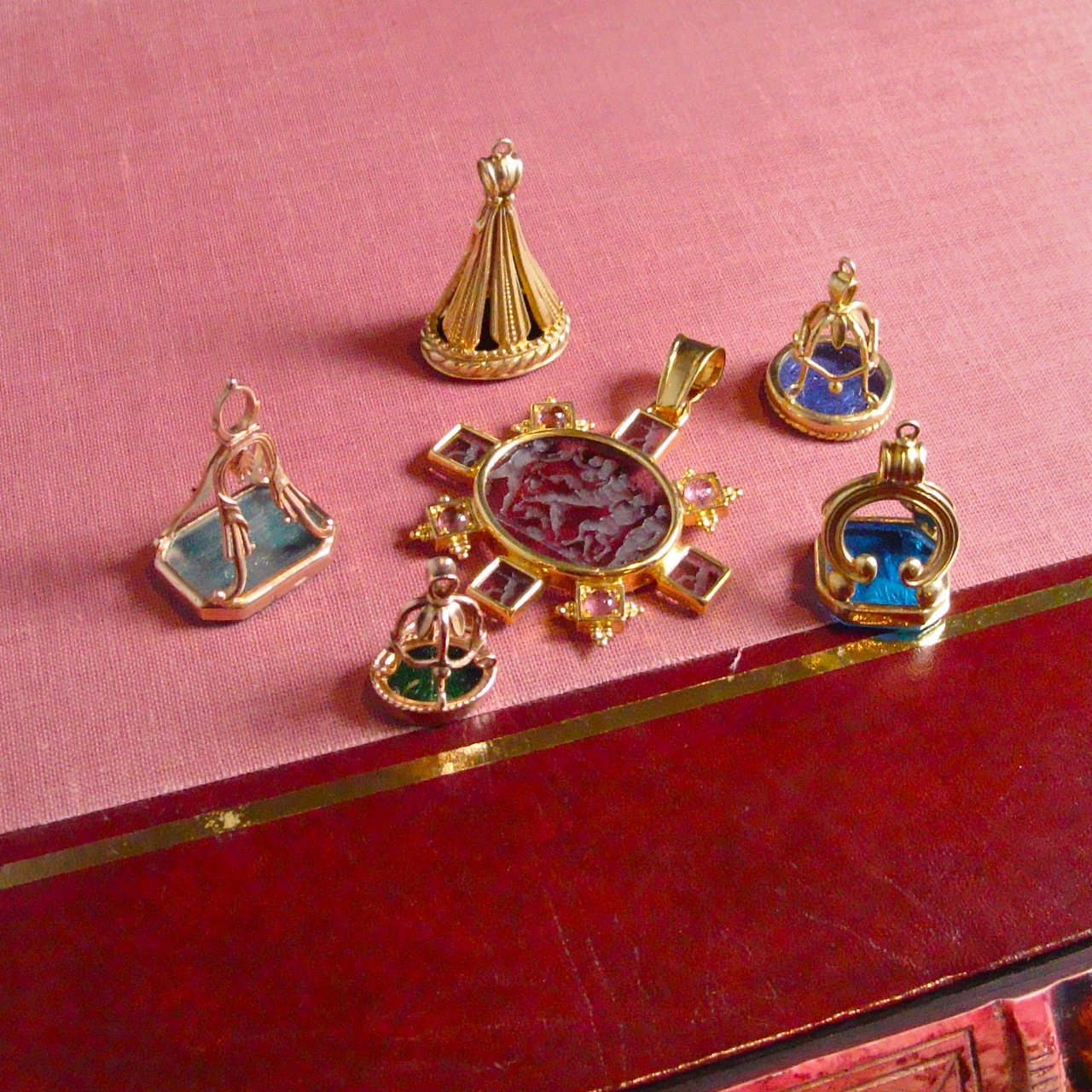
Italian Glass Intaglio Fobs


The shanks/bales of these reproduction glass intaglio fobs are taken from Italian antique fobs 
Since I have always been enamored with intaglios, it will come as no surprise that I also love intaglio fobs.  Intaglio fobs were worn as little charms when men wore pocket watches and were also frequently used to individualize wax seals on letters and documents.  Although many antique fobs are made of carved stone, glass intaglios were also a very popular item.  The subject of the intaglio carvings included monograms, family crests, little verses, animals, flowers and mythological images.


As part of my recent trip to Boston, I arranged a meeting with the US rep for an Italian line of antique reproduction glass fobs.  Our meeting was like being in a  candy store - and it was VERY difficult to limit myself to just a handful to get started.  These intaglio fobs will become part of a new jewelry group called the Grand Tour CollectionAlthough I have not had a chance to make them up just yet, I thought you might like to see a preview of what will be coming in the near future.  If there is something that catches your eye - shoot me an email - I will be happy to work with you to create a custom design for a necklace or bracelet.                     

Wednesday, August 25, 2010

Autumn Preview - Make A Statement This Fall!

Friday, July 23, 2010

In Good Company - Etsy Treasuries


July in  Arizona is not a month that inspires anyone to do anything but sit quietly in an air conditioned room.  Yes, you have all heard the little saying about the unbelievably hot temperatures of an Arizona summer - “Yeah, but it’s a dry heat!”.  I have somewhat deduced that there is about a 10 degree temperature differential from the rest of the universe.  When it is 90 degrees in Arizona - it feels like 80 degrees in Boston / when it is 115 degrees in Arizona - it feels like. . .well - REALLY HOT!  It is the kind of weather that inspires me to do absolutely nothing - and so I did!
Although I was doing  nothing - the rest of the universe was doing something!  My jewelry designs are also on several sites in addition to my own web site - one of which is called, Etsy.  Etsy is a site that focuses on  handmade designs of all kinds and the supplies that go into those designs as well as vintage items and antiques from all over the world.  It is a great way to amuse yourself on a blazing hot summer day!
Part of the Etsy culture is individuals that troll through the mountains of items (seriously, there are gazillions) looking for just the perfect styles and colors to create little themed “Treasuries”.  I suspect the curators are hoping that their treasury will end up on Etsy’s front page.  Although I have never tried to curate a treasury, I have been  featured in several and July was a very busy month for the rest of the universe - my jewelry designs were featured in eight 13 14 treasuries! I was also featured in Etsy’s “Storque” which is like an emailed newsletter that goes out to thousands.  Sadly, I did not get a snapshot of the Storque feature to archive.


If it is blazing hot where you are this summer, and you need some quiet internet trolling time - check out Etsy.  You will find everything from kitsch to couture and may just wish you had not thrown out your daughter’s Strawberry Shortcake Lunchbox!

Tuesday, July 13, 2010

Charmed, I’m Sure

Source Unknown


Mary Drysdale


Branwen Bed by Ironies


I recently took out my little stash of Tanzanite gemstones and decided it was time to make up a new necklace design.  Usually, my next obvious step is to see what scrumptious interiors images include that color as a spring board for the design of the jewelry.  Trouble is. . .exactly what do you call the color of the tanzanite stone - periwinkle, blue, violet, lavender?

James Merrell


Phoebe Howard via Brook Gianette


Southern Accents via Porterhouse Designs

In the end, I decided that tanzanite crosses such a wide range of colors that it could be classified as almost any of the mentioned colors.  Based on the inspiring interior designs I came up with - I further decided it would be lovely mixed with a whisper blush pearl stationed along the chain to enhance the unique color.  Since I had all differing values of the above mentioned colors already out  on the tray for comparison, I then decided that I should use them all to some degree in the design.


The first item that came to mind was the unique slice of amethyst stalactite with it’s Alexandrite colored “eye” and the soft violet colored spiny crystals.  This unique textural explosion would became the focal point of the necklace.  The plump pink amethyst “kiss” dangling just above the prickly stalactite would repeat the violet colors of the outer crystals while a deeper amethyst briolette could add the deeper dimension that was needed for contrast.  Throw in an amulet of the Alexandrite green colored prasiolite to accent the eye of the stalactite and a whisper blush baroque pearl to marry the accent colors of the hand linked chain and we seem to have covered all the possible choices of the defining names that could be used to describe  the color of Tanzanite.


After everything was placed on the tray, the key to all of this (no pun intended) was a happy marriage of unique shapes, texture and colors that all play nicely together in a meaningful way.  And. . .there you have it - the idea for Charmed, I’m Sure was conceived. 

Friday, June 25, 2010

You're Invited. . . But Oprah's Not! - Carte Blanche Summer Sale

Click here to go to the Carte Blanche Summer Sale!

Tuesday, June 8, 2010

The Modest Nudist

My dream closet belongs to Miriah Carey

Most designers (hopefully) have an epiphany early in their careers when dealing with a client that has no idea (or simply cannot communicate) what color scheme they would like for a project.  A smart designer will quickly realize that all clients want their room designs to become the perfect backdrop for their sense of style, but very importantly, complimentary to their own coloring.  If I’ve said it once, I‘ve said it a thousand times. . .”go look in your clients’s closet to get a better understanding of what colors will appeal to them.”  Design clients (almost without exception) tend to like the colors that look best on their complexions.

If that theory is true (and after 25+ years - it has never failed me!), I wonder what I would have done if a nudist had been a client!  Obviously, a few rules would have to be put into place before that scenario played out - starting with Rule #1:  Clothing must be worn to all meetings with the designer and assistant!  Seriously, I guess my theory would have been a perfect test this year with all the neutral/nude colors that are so abundant.


Neutrals have long been a favorite of the American public because , quite frankly, you really cannot screw-up an all-neutral color scheme if you are a DIY “Decorette”.  Moving to AZ was like moving to a sea of beige and brown - not exactly a design challenge for a seasoned designer!
Here is a little mental design exercise for all you closet nudists!

via Apartment Therapy

via Martha Stewart

via A Gift Wrapped Life

via Southern Accents
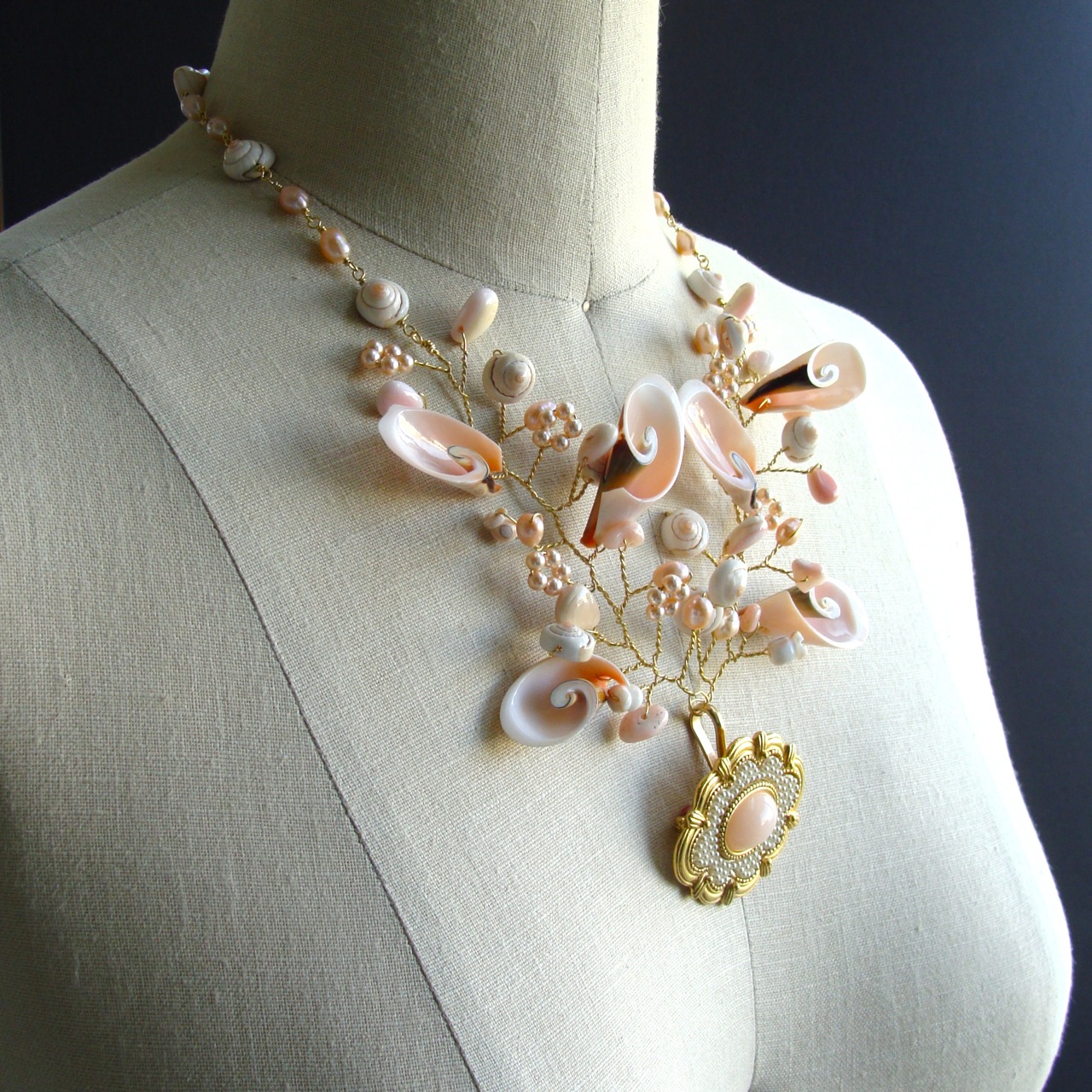
The new neutrals are a bit more to my liking since they have less to do with the Mediterranean neutral undertones of gold and green (I live in a world where the popularity of “Tuscan” has turned the Arizona design community into “theme park facilitators”).  The new neutrals/nudes focus  more toward a pink/peach undertone which is a more friendly color for all skin tones.  This new and subtle shift in the neutrals palette has taken a cue directly from this spring’s fashion trend - and I, for one, am thrilled.      
Since the nexus of this blog was to show you exquisite jewelry designs inspired by breathtaking room decor - I find myself twirling in a vicious circle.  Did the current fashion trend inspire the interior design industry or the jewelry first?  


Oh well, I suppose all three design categories can live together side by side - happily influencing one another.  Clearly, the strength of the neutral/nudes trend has already influenced both the jewelry market as well as the interior design market.  Suffice to say that the fashion industry will probably scamper off on a new course by next spring while the interior design industry will quietly morph this years trend into a more durable entity.